In previous versions of Kdenlive in some effects like pan & zoom and in the transitions Affine and Composite you had this little red rectangle to modify size and position: 
Additionally you had several move and resize operations available in the menu of the configure button. For 0.7.8 I tried to make editing this type of parameter more convenient and efficient. Now editing the same (sample) project looks like this: 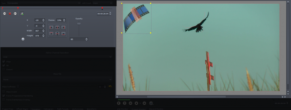
As you will see all the options previously available but hidden do now take most space in the effect stack. The red rectangle disappeared therefore you can now drag and resize your item directly on the monitor. So let’s have a look at the controls in detail:
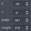 The first column is pretty obvious. You can modify position (with the top left corner being (0|0)) and size.
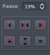
With the resize field you can resize relative to your project’s resolution. Using the buttons you are able to either move the item to one of the frame borders or center it as shown by the icons.
 This setting, used to modify the clip’s opacity is only available in some effects and transitions.
All of the above settings are keyframable, which means that their value can change over time, thus they are only enabled if you are at the position of a keyframe. The values between two keyframes are calculated using linear interpolation. For working with keyframes you have the following tool (not available for all effects): 
The upper part is a little timeline, with the red polygons being keyframes and the little gray triangle showing the current position. Similar to the project timeline you can change the position by dragging the little triangle. A double click either adds or removes a keyframe. The position of keyframes can be changed by dragging their upper part (the rotated rectangle).
The two arrow buttons move the timeline cursor to the next/previous keyframe. The button between them might also look like this ![]() and either adds or deletes a keyframe. The button with the link icon can turn on/off syncing with the project timeline. This means when you change the position in the project monitor or the project timeline the position in the keyframe timeline will be updated accordingly. Of course this also works the other way around.
and either adds or deletes a keyframe. The button with the link icon can turn on/off syncing with the project timeline. This means when you change the position in the project monitor or the project timeline the position in the keyframe timeline will be updated accordingly. Of course this also works the other way around.
Still missing the configure button shown in the original screenshot? This one shows and hides additional options which have no influence on the actual video. 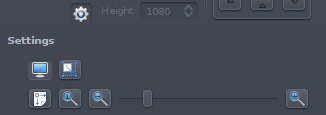
The first button switches the monitor between edit and (normal) playback mode. While it is possible to playback in edit mode this won’t be fluid. Actually it is even throttled to update only every 100ms because otherwise Kdenlive would not respond anymore during playback.
When the second button in the first row is checked the item will update while performing a move/resize on the monitor, otherwise only the rectangle border (yellow line or grey dots) will update during the action and the frame will refresh when the mouse button is released.
Using the controls in the second row you can zoom the monitor. This does not change the video! The first button will make the video/background frame (not the edit rectangle) fit into the monitor, whereas the second button will show the frame in its original size (resolution in project settings).
And now, finally, to the monitor. At first a screenshot showing the monitor in edit mode zoomed out: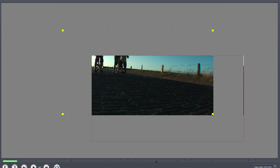 The rectangle with the black+gray (or yellow if the item is not selected) border and the yellow handles can be resized and moved. If the handles in the corners are not visible you cannot edit the item because you are not at a keyframe. In this case double-click to add a new one. The red dotted frame represents the actual video frame. For reference the same frame in playback mode:
As you can see what was transparent now turned black.
That’s about it.
Now some Questions & Answers:
- I really do not like this feature at all! Where’s the tiny red rectangle hidden?
- You can switch back to the old GUI in the settings dialog.
- I used the Composite transition for some movement but I did not like the quality of the movement at all.
- Yes, the Composite’s movement interpolation is not that good yet. If you you want to achieve a Ken Burns Effect (Pan & zoom) use either the Affine transition or the Pan & Zoom effect. Their interpolation quality is far better.
- The monitor in edit mode is very slow and not responsive.
- You do not mean during playback, right? This might depend on your graphics driver. For me it was very slow using the nouveau, but is very fluid using nvidia one. Additionally making the monitor smaller can also speed things up.
Till Theato (ttill)
I don’t know where else to bring this up, but I have always been puzzled by the “Affine” effect. I really don’t know what it’s intended for, or what the difference between and ‘affine composite’ and a straight ‘composite’ effect is. The term ‘affine’ has some rather obscure meaning relating to a geometric translation some such thing or other, but I have never ever heard this term used anywhere but maybe a geometry book, and certainly never in video editing programs. I’m wondering if some less esoteric term might be dreamed up for whatever it does, so that the average non-mathematician kind of user might have a clue as to what it might do without reaching for a dictionary.
@ArtInvent: Besides moving and resizing, you can also rotate and shear using the affine transition. Additionally panning and zooming will look better using Affine because of better interpolation.
On the other hand, composite has options to control the alpha channel.
Is there any term you would prefer?